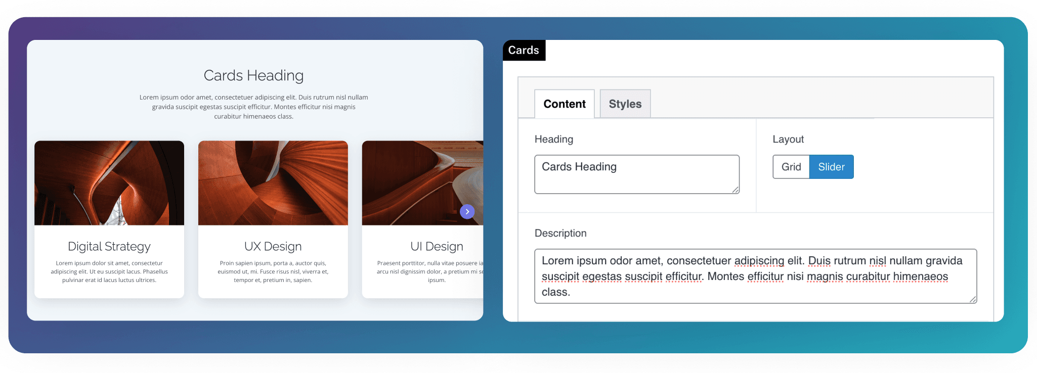
Cards
Display manual or linked cards with images, headings, descriptions, and calls to action in grid or slider layouts.
Overview
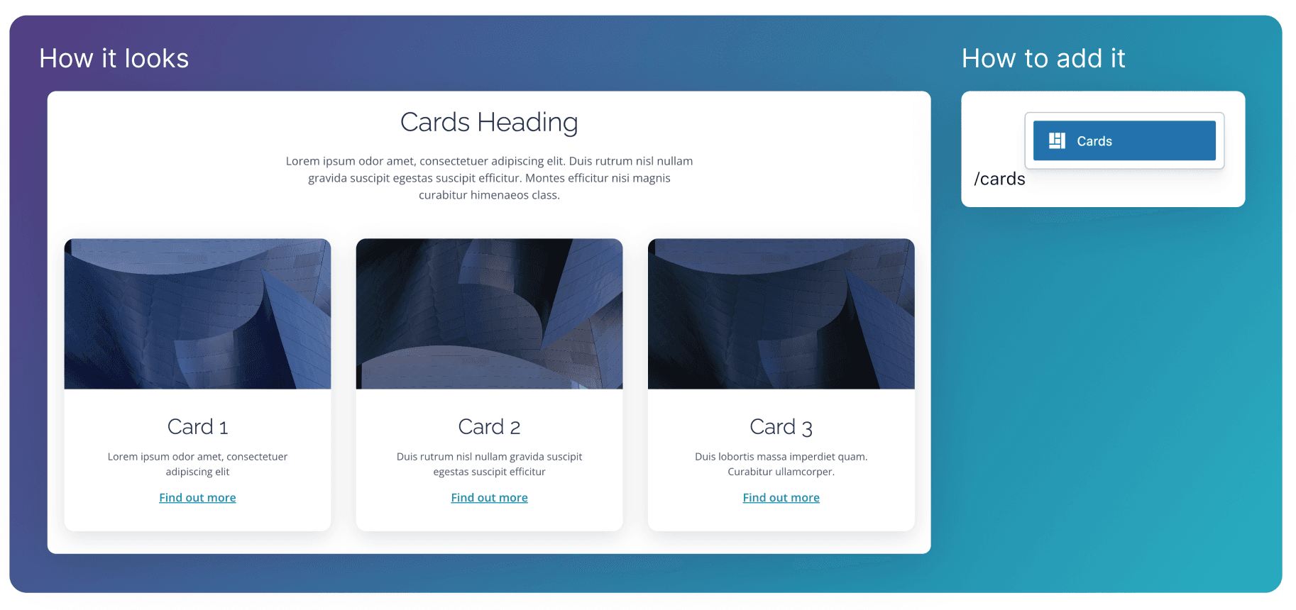
The Cards block displays cards in a row, each with an optional image, heading, description, call to action, and the ability to link to a different page.
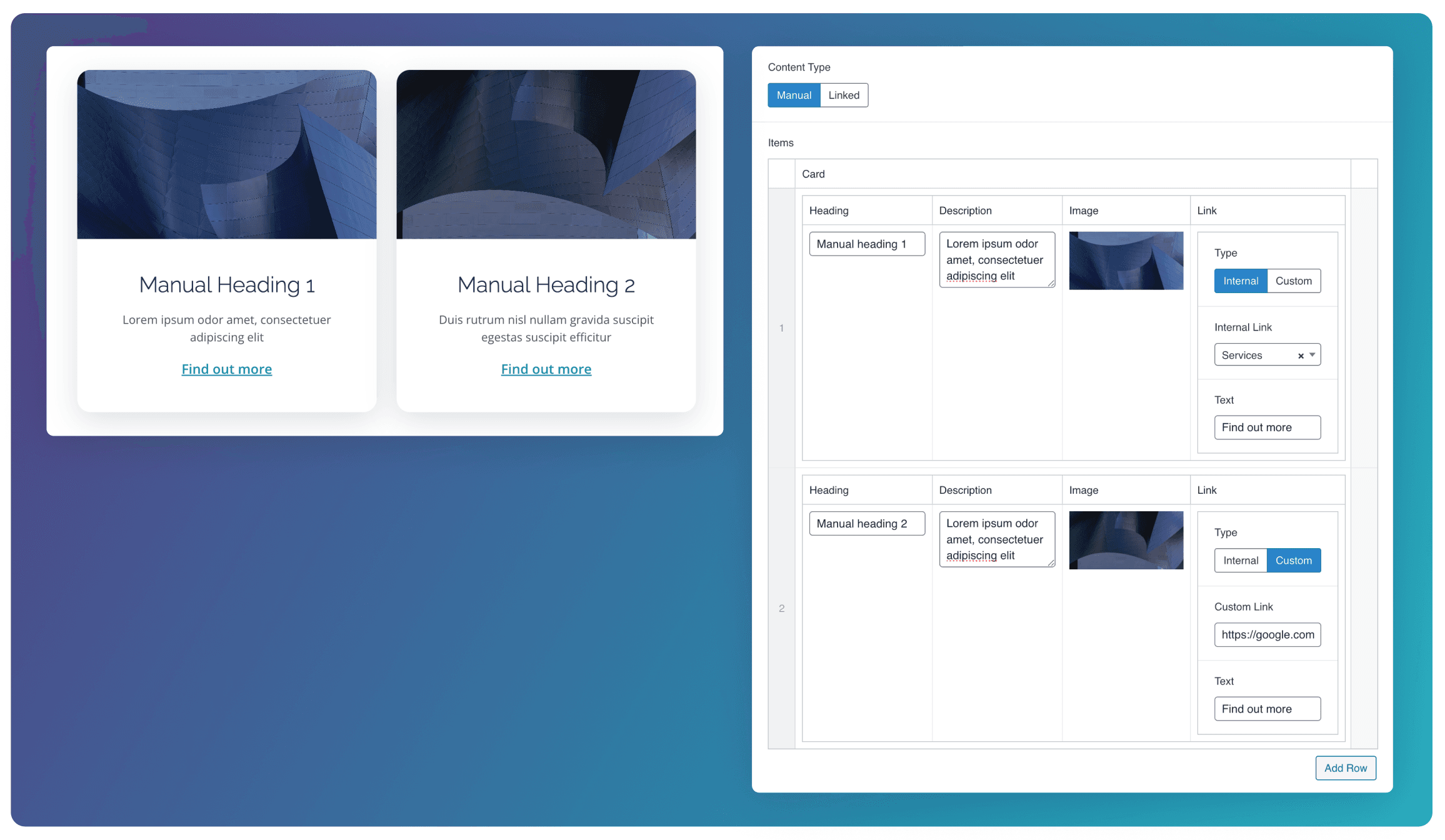
Manual Content
When the Manual content type is selected. You’ll be able to create each card using a Repeater field. You can then manually set the Heading, Description, Image, and Link for each card.
Linked Content
When the Linked content type is selected, you can choose to link existing Pages, Posts, or People on the site. This will automatically pull in the image from the Featured Image, and the description from the Excerpt or body content of the selected post. The Button Text field can also be used to add a call-to-action at the bottom of each card.
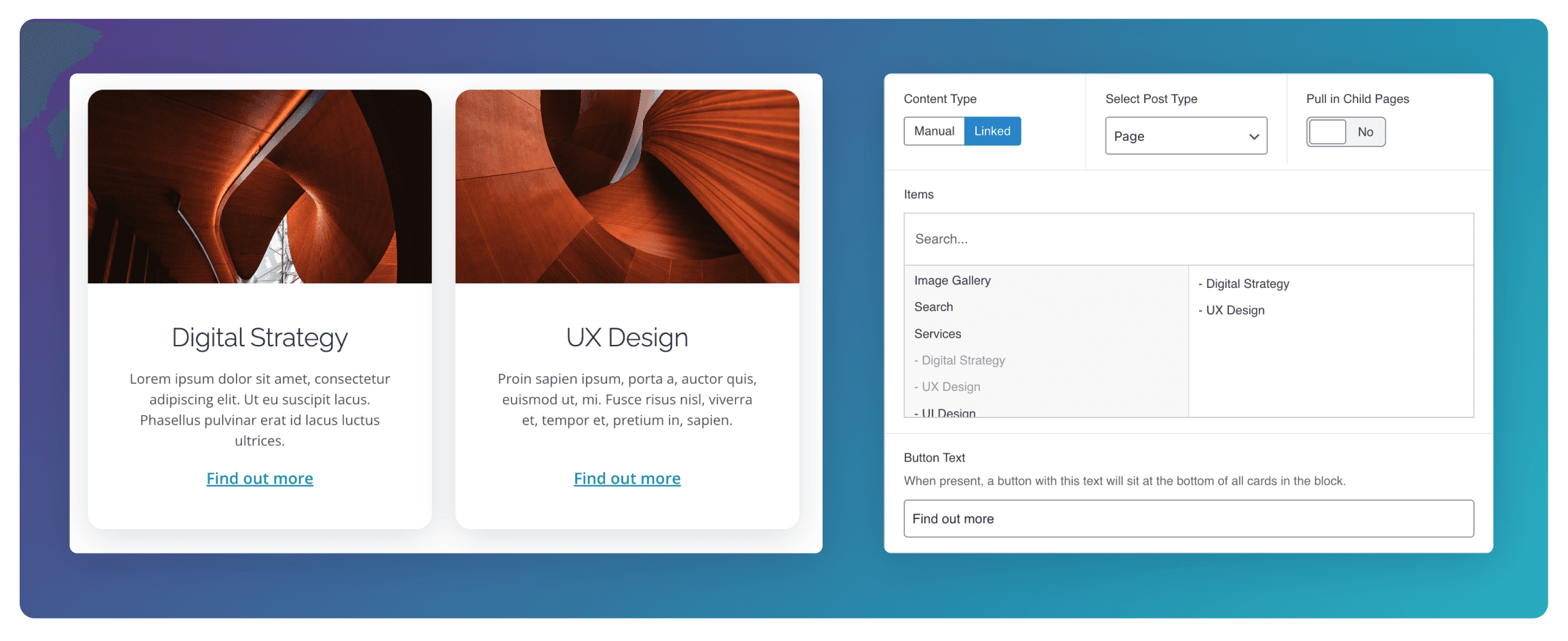
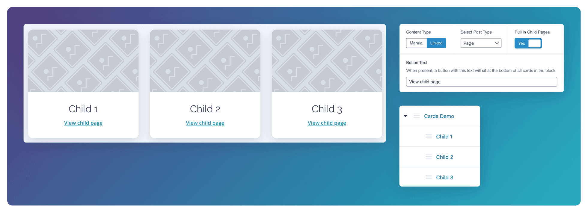
Displaying Child Pages
When the Page post type is selected, toggle Pull in Child Pages in order to display content from any children of the current page being edited. In the example below, childp of the “Cards Demo” page are being pulled in. See here for how to create child pages.
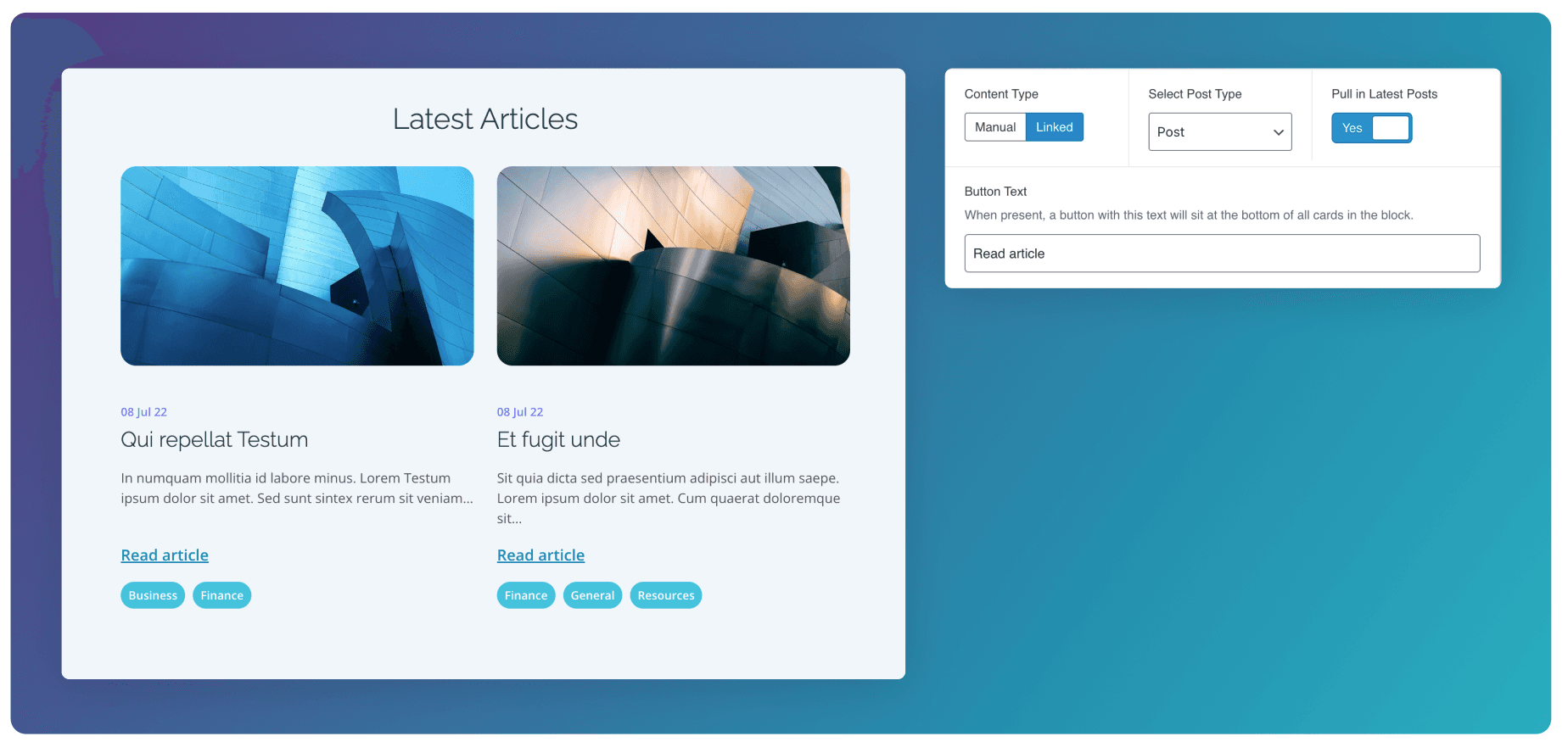
Displaying Latest Posts
When the Post post type is selected, toggle Pull in Latest Posts in order to display the most recently published posts. The publish date and any associated tags will be shown on the cards. The number of posts that will be displayed depends on the number of Columns selected.
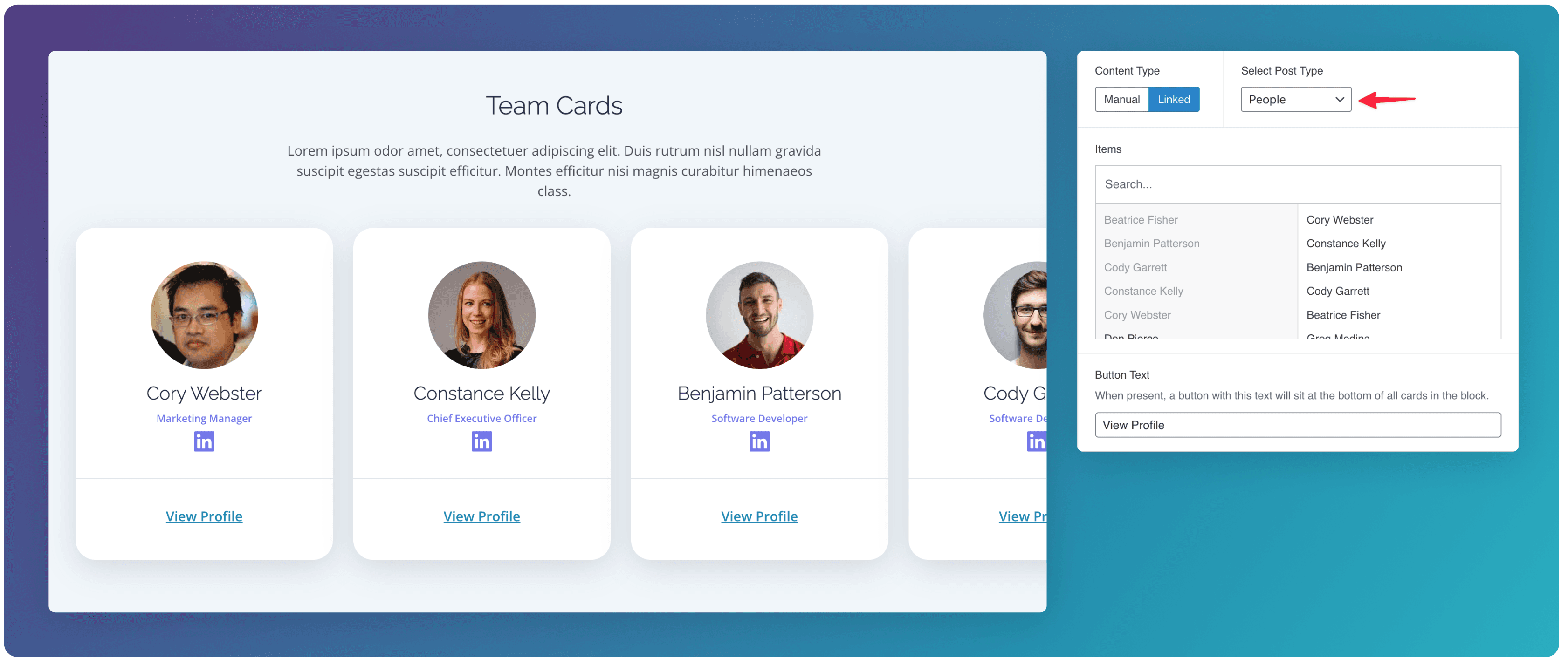
People
Selecting the People post type displays the selected people in a unique card design that shows information relating to their profile. These fields such as role, and linked in url can be edited in the People template of the CMS.
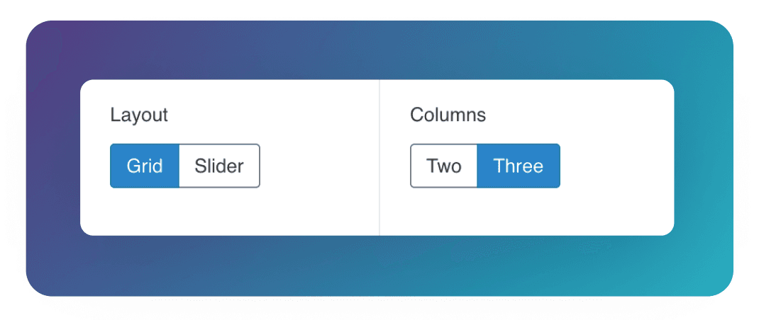
Layout
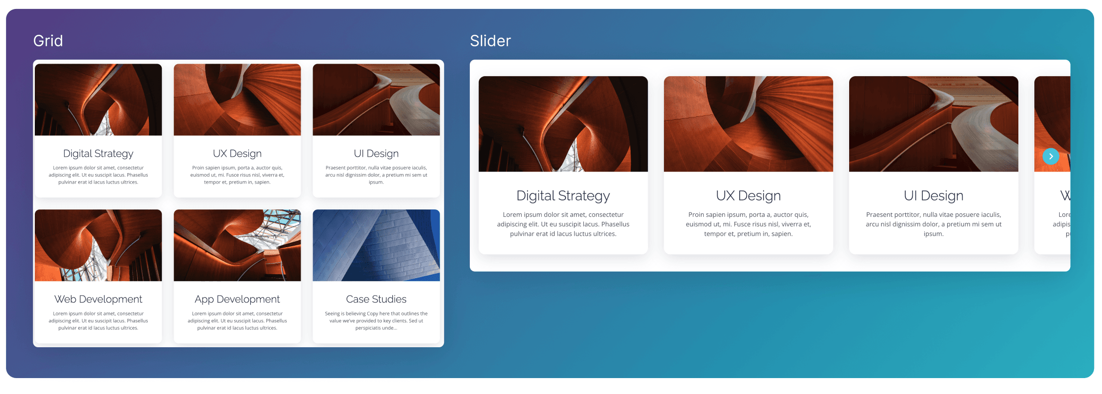
The Cards block can use either the Grid or Slider layout.
When set to Grid the cards will be set out in a row. When the maximum number of cards per row is hit (Two or Three, set by the Columns toggle), more rows will be formed, creating a grid design.
When set to Slider the cards will be laid out in a single row. If the width of the screen is exceeded, the rest of the cards can be displayed by scrolling or clicking the arrows.
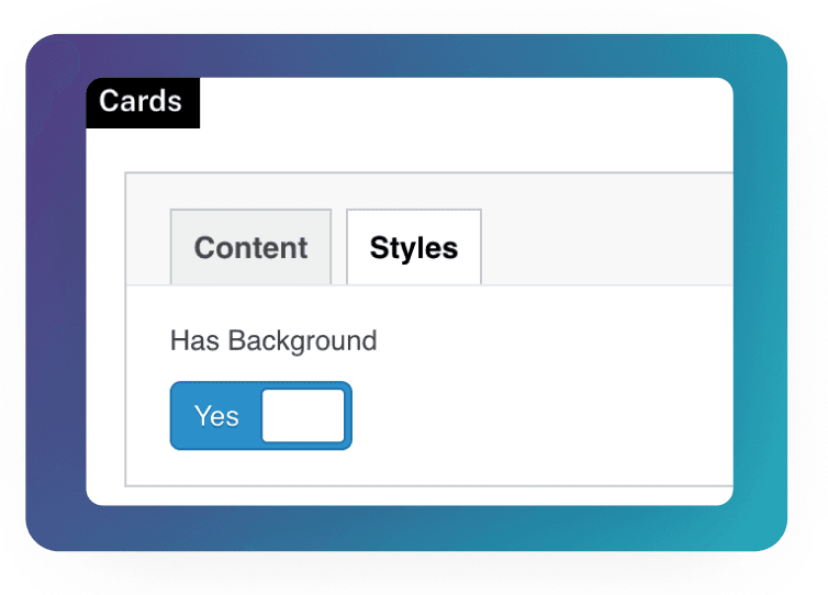
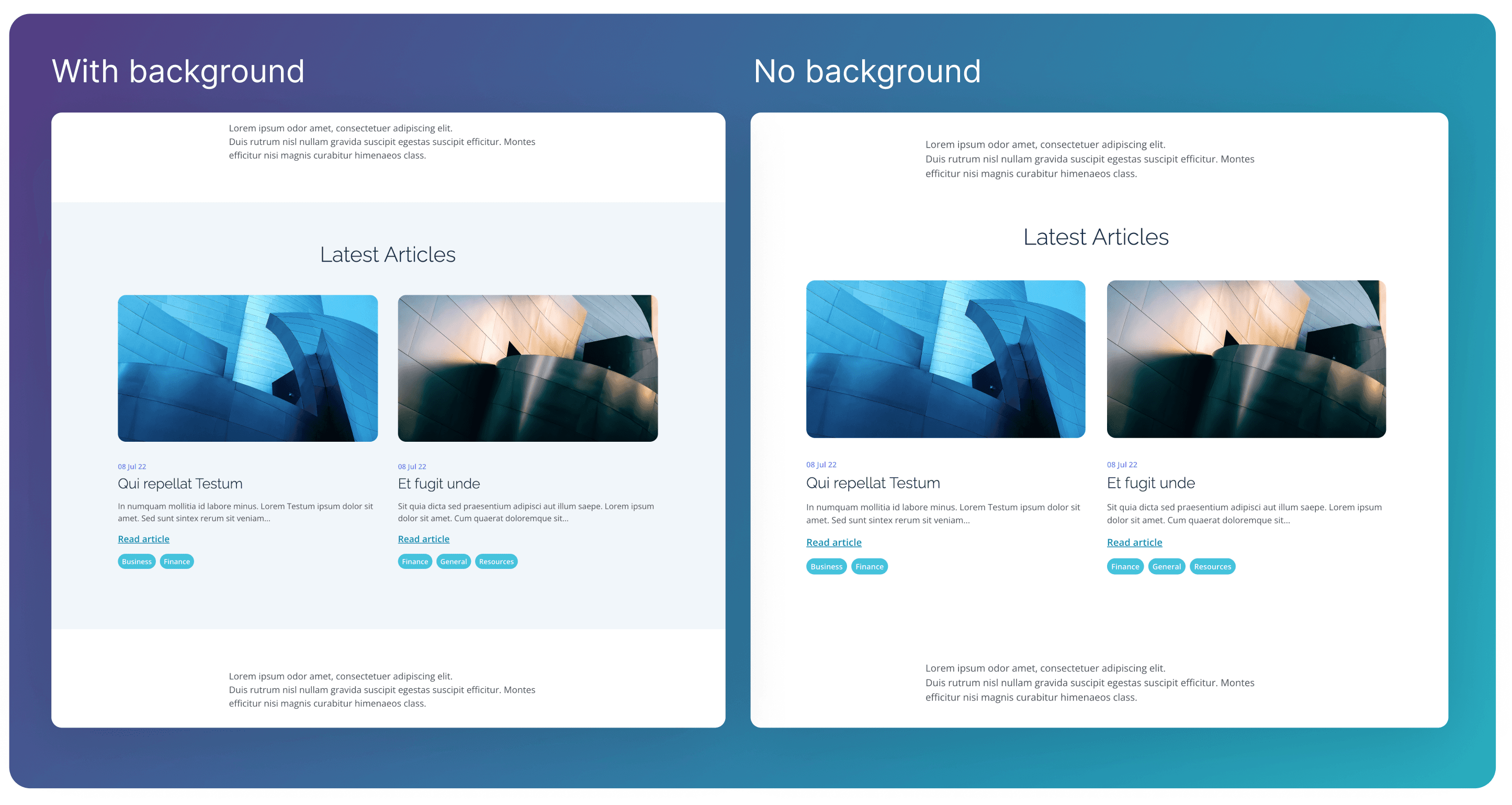
Styles - Background
Inside the Styles tab, use the Has Background toggle to hide or show a background colour behind the Cards block.
Heading & Description
You can optionally add a heading and a description to the block by using the corresponding text fields.