Image Guidelines
Prepare images for the CMS with practical guidance on sizing, optimisation, breakpoints, focal points, and component-specific image requirements.
File Size Optimisation
In order to ensure the best possible page speed, it is important to optimise your images before uploading them to the site.
Once you’ve prepared and exported your images, we would recommend using a service like TinyJPG to reduce the file size whilst retaining image quality. This tool is free if you upload up to 20 images at a time.
The video below will take you through all the steps required to optimise your images with TinyPNG:
Image Size Guide PDF
Click here for a size guide PDF
Components & Image Guidelines
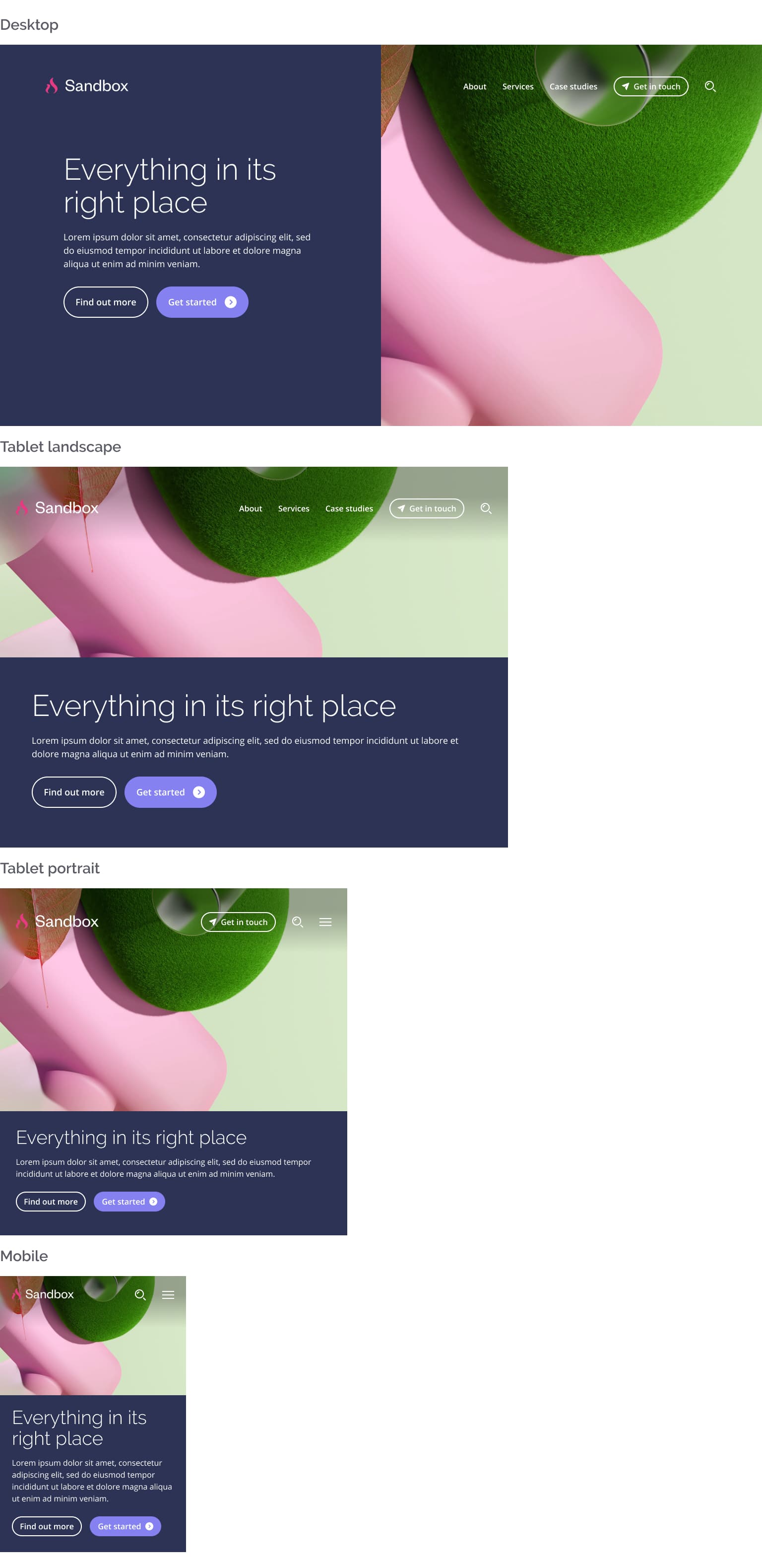
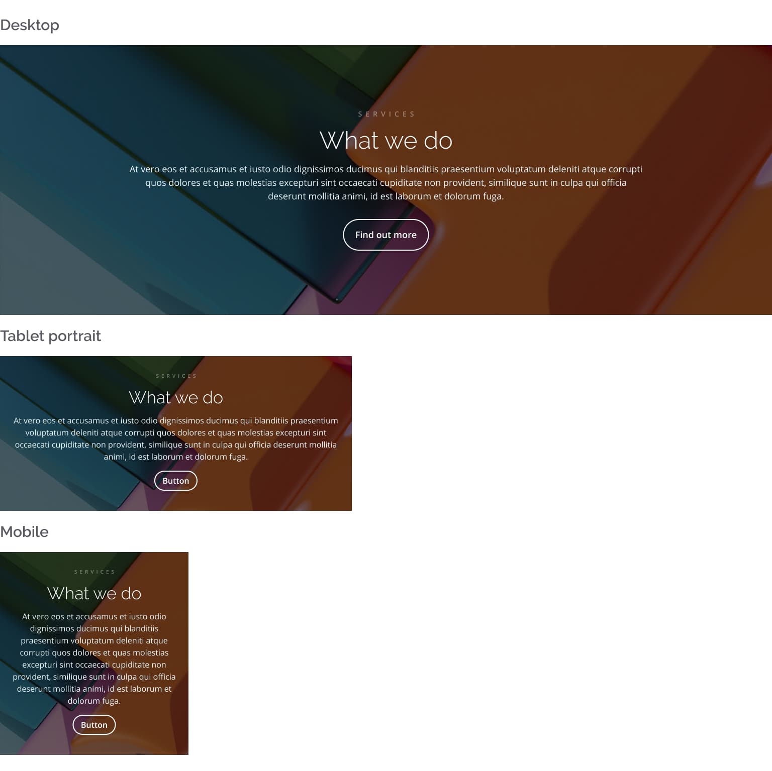
Homepage Hero Image (full width)
Due to the responsive nature of the platform, some images will be displayed differently depending on the device and screen size.
A good example of this is the feature image on the homepage hero section. See below how this image is displayed across different breakpoints:
With this in mind, when using the full width version of the hero section it is recommended that you position the focal point of your image on the right hand side, leaving some clear space for the text-based content on the left hand side.
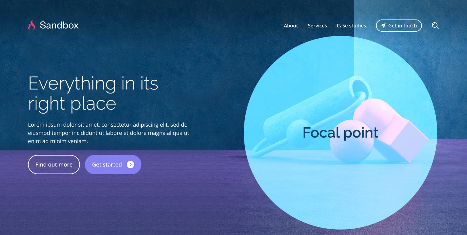
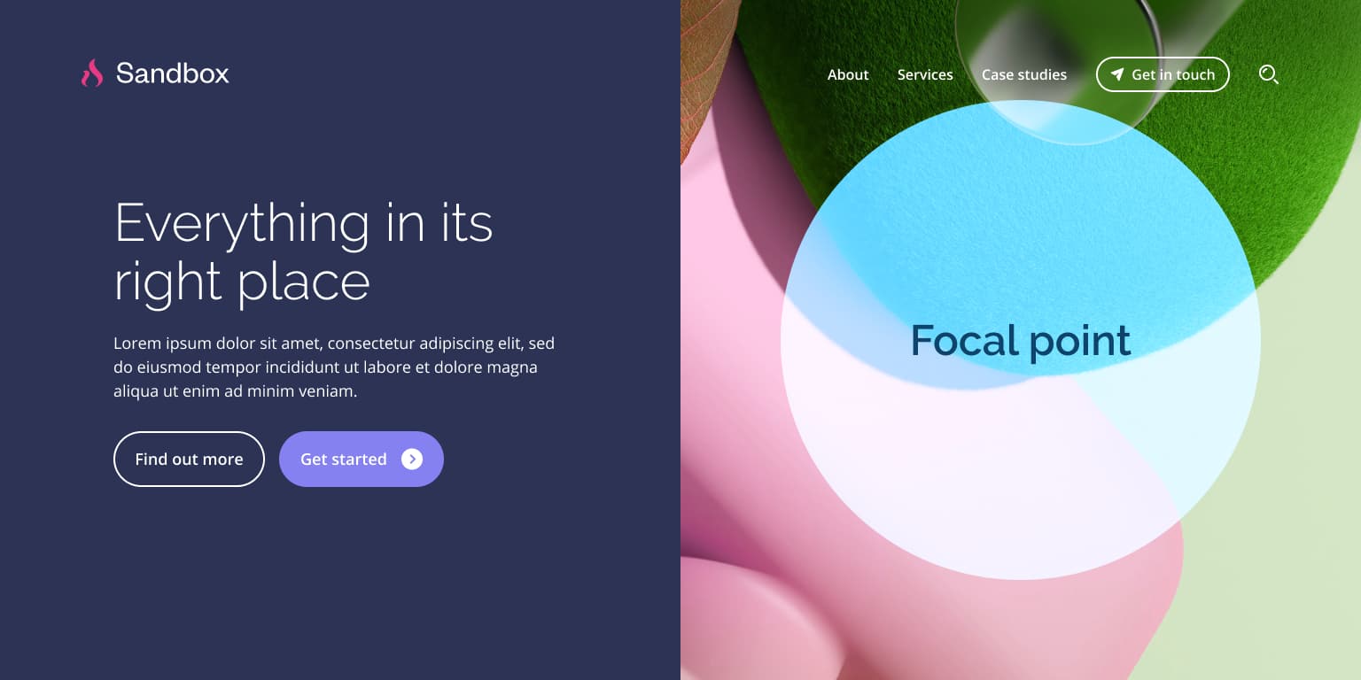
Recommended focal point for the hero image.
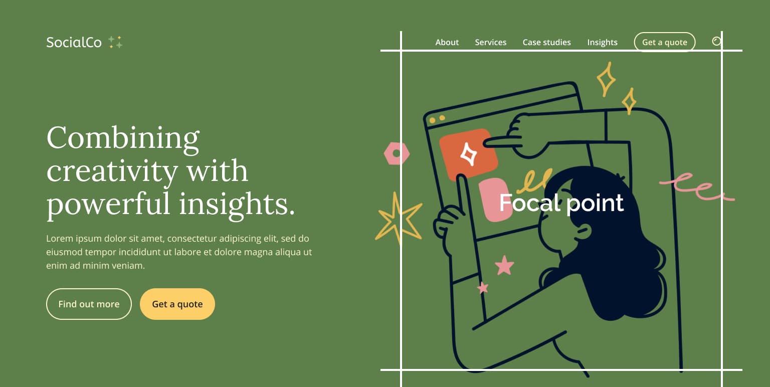
Here are some additional examples:

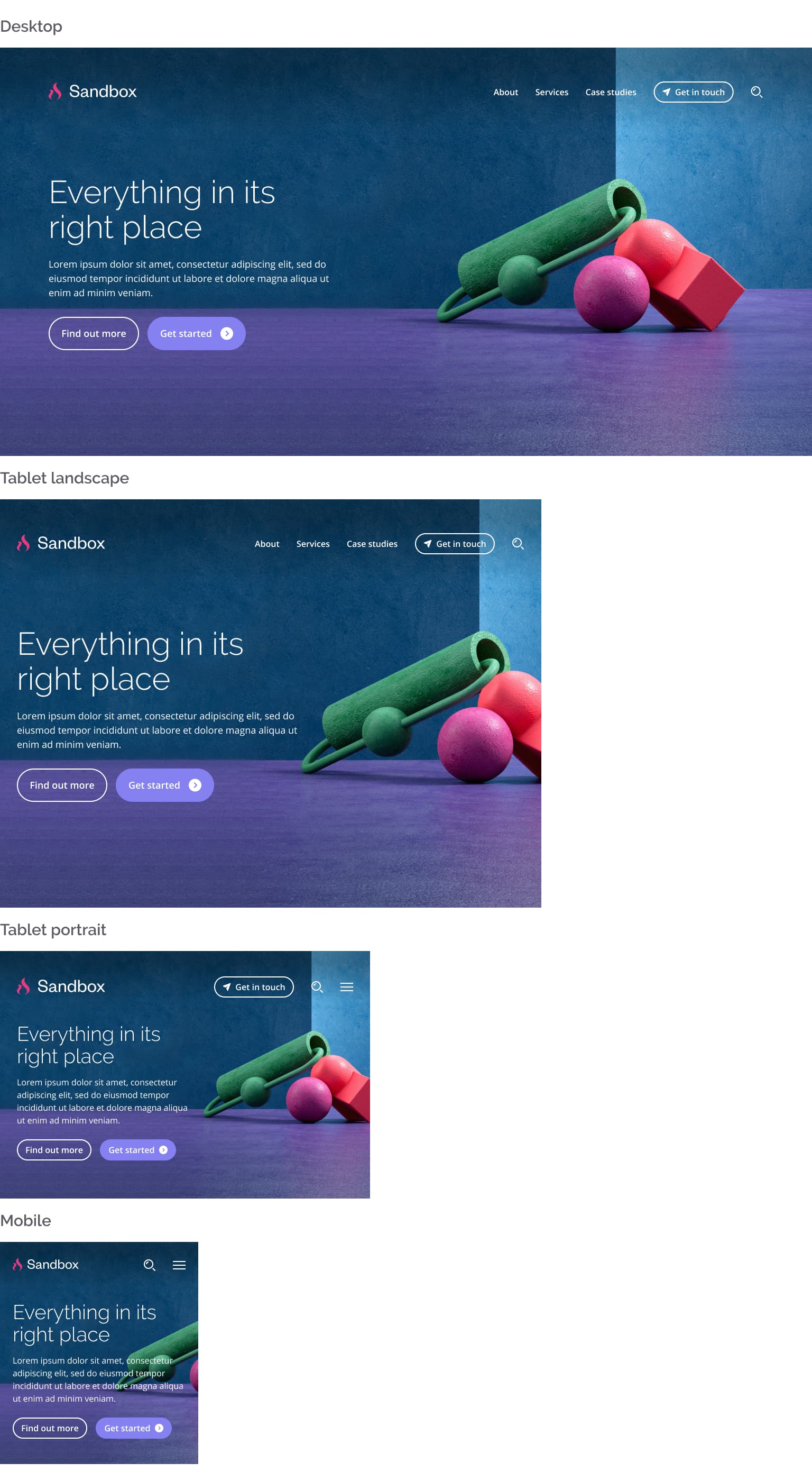
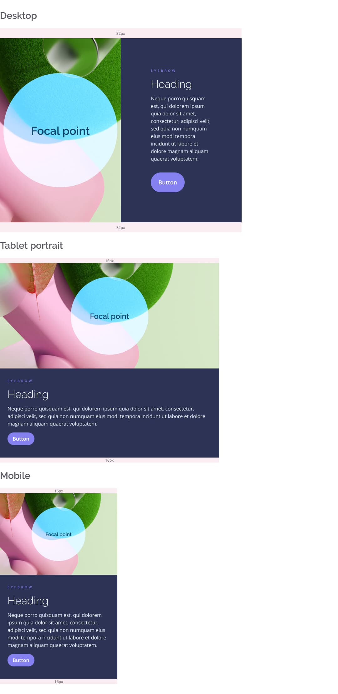
Homepage Hero Image (side-by-side)
The side-by-side variation of the hero section can be more forgiving, however some cropping will still occur on tablet and mobile screens. See below:
In this case, it is recommended that the focal elements are positioned at the centre of your hero image.
The same rule applies to 50/50 CTA blocks (side-by-side) throughout the site.
50/50 CTA Component (sidebar variation)
There are some aspects to consider when using the flexible content page with a sidebar, as the CTA module will behave differently due to the narrower content area.
On the single column variation of the flexible content page, the CTA component takes the full width of the page, and behaves similarly to the side-by-side homepage hero image detailed in this document. When using a sidebar however, this component is limited to the smaller content area, so the image might be cropped and look taller depending on the amount of text next to it. See below:
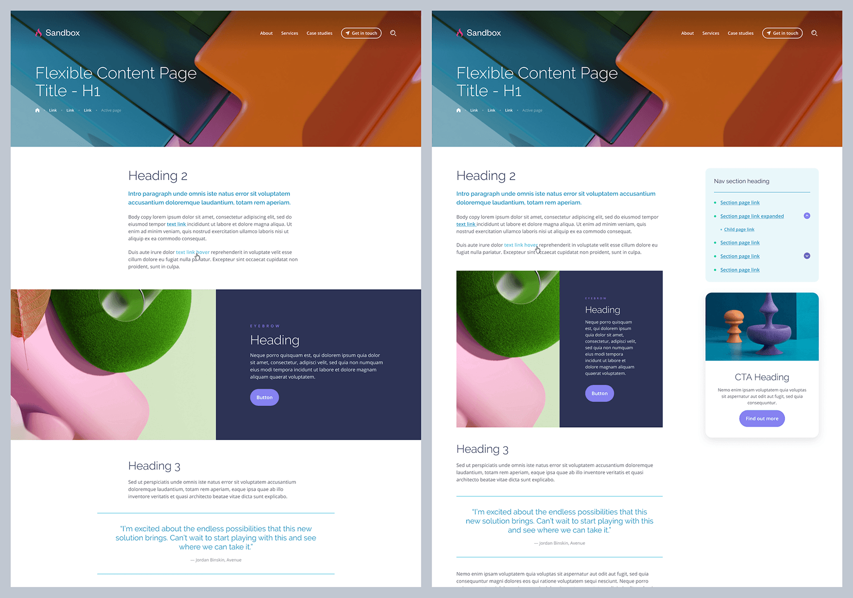
Below are some examples showing how this component looks across different breakpoints. The same central focal point rule applies here, to ensure any key aspects of your image are displayed correctly.
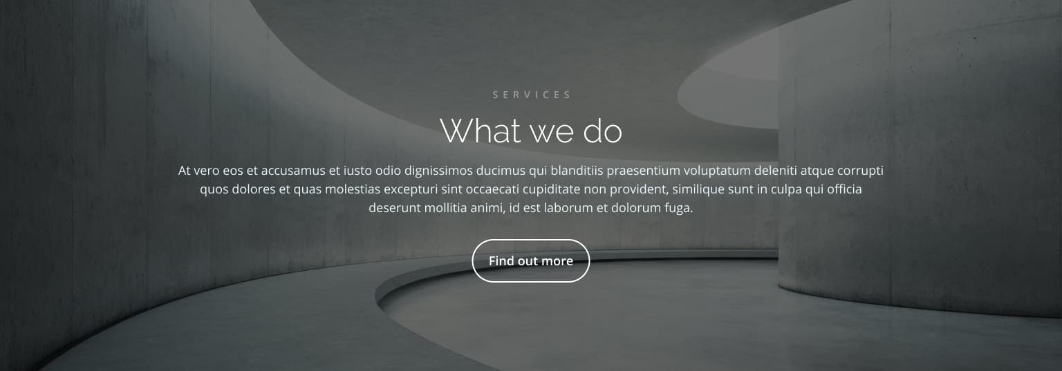
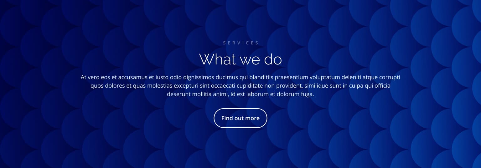
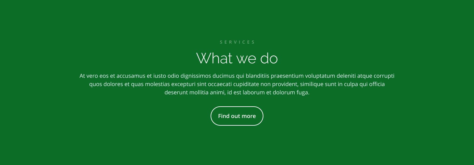
Full Width CTA Block (Homepage)
The feature image used on the full width CTA block is displayed as a background.
This background will be cropped in different ways depending on the screen size, so we recommend using images that are not too busy or complex. This will ensure they work nicely across devices and don’t compete with the text in the foreground. See below how the component behaves on different breakpoints.
This component also includes a dark overlay that ensures text is readable, even if a light image is used in the background.
See below some examples of suitable visual assets for this module, including textural images, simple patterns and solid colour backgrounds:

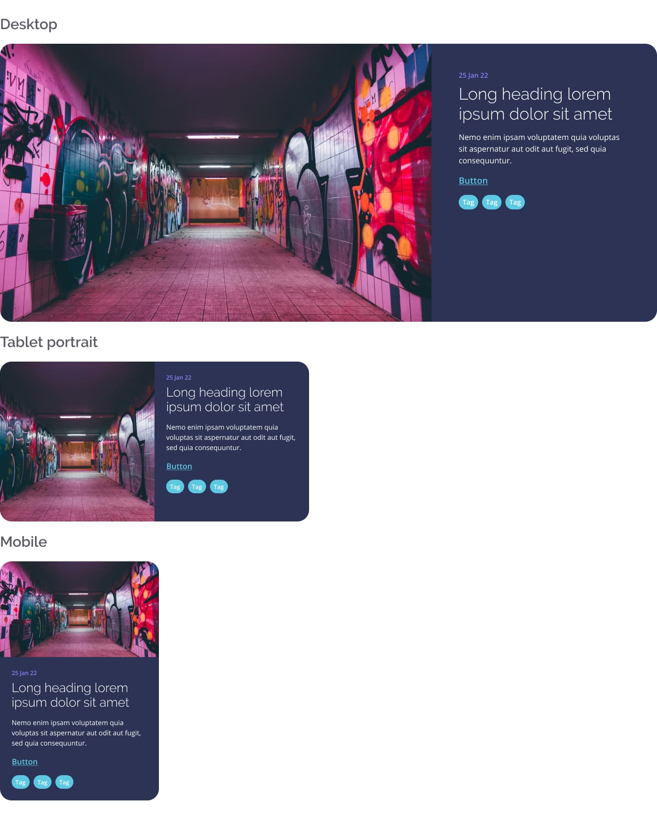
Feature News Module
The Feature News Module is displayed at the top of the News Index Page. This component behaves similarly to other side-by-side modules, and a central focal point is recommended. See below some examples of its behaviour on different screen sizes: